With this, Chapter #9 in the series Top Ten Design Elements, we are almost near the end. These are the top ten elements that I love to see in a room to make it aesthetically pleasing to ME. The list is so subjective, even to my own taste. There are rooms I adore that might have only 2 or 3 elements – some have all of them. Some of these elements seem so basic – light fixtures? Don’t all rooms have light fixtures? Well, no, they don’t. I lived without hanging light fixtures in most of my rooms for years and years! It took me over 15 years to collect all my lanterns and chandeliers – replacing those awful ceiling fans as I went along.
Don’t all rooms have linen? No, they don’t. I can’t tell you the number of clients who tell me right off – no linen! I hate linen. It wrinkles. It’s messy looking. Yes and yes – which is why I love it so much. Linen is cozy looking, relaxed, homey, and welcoming – all things that a house should be, in my opinion anyway.
Wall Décor? Come on, that’s a joke! What room doesn’t have wall décor? OK. I’ll give you that one. But as I explained in my chapter on Wall Décor – I mean mirrors, plates, tapestries, sets of framed prints – not necessarily framed oil paintings. There’s a difference, subtle, but a difference all the same. And so it goes. The list is personal. It’s a group of elements that I have found I’m attracted to in picture after picture. So, if you like my design aesthetic, you might be interested in my list. If you hate my style – you still might be interested in the things to avoid so you don’t end up with rooms that look mine! Here’s a quick recap of the 8 design elements to date:
Linen
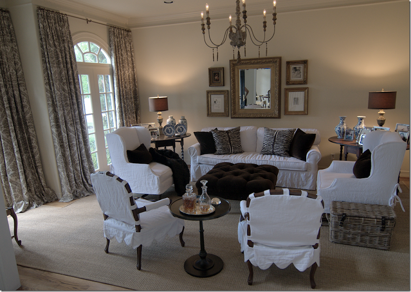
Like I said earlier, linen is my favorite fabric – for all the reasons that some people just hate it. Here, in this family room in Houston that I designed earlier this year – all the furniture is covered in white linen, while the curtains are a linen/cotton blend. But linen doesn’t necessarily mean slipcovers. My own living room was once all Bennison linens– but they weren’t slipcovers.
Slipcovers
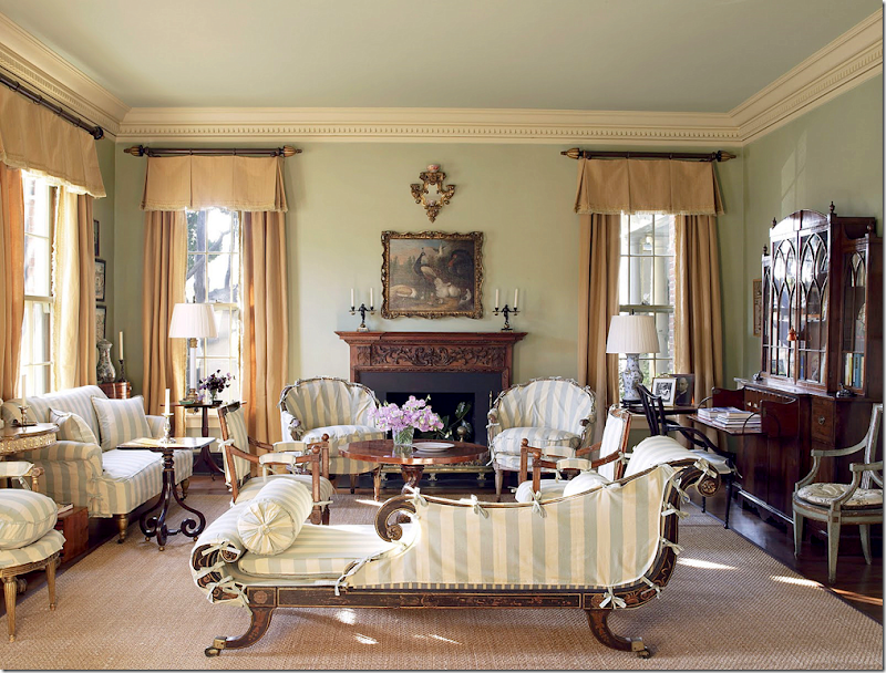
Just as linen doesn’t mean slipcovers, slipcovers doesn’t mean white linen. Here – a cotton white and aqua stripe covers the winter upholstery in Suzanne Rheinstein’s living room. Once her slips are put on, the look of the room changes dramatically. Most people, though, use their slipcovers all year round.
Seagrass
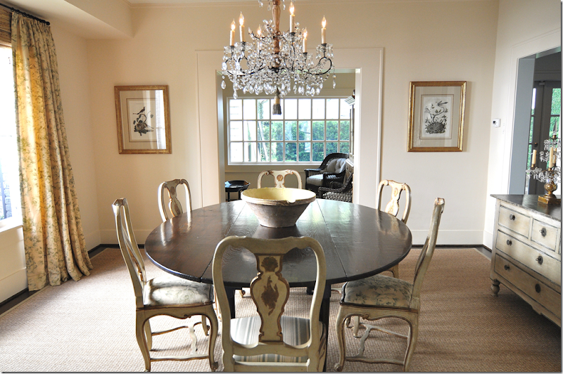
I love seagrass – especially when it is custom cut to fix the room exactly – just as it is here. Jane Wood designed this room – the seagrass looks like it is about 3 inches from the wall. I like to do around 5” – though some clients want more of their wood to show, especially if it is pretty wood. Seagrass is a much more user friendly product than sisal which stains terribly.
Curtains
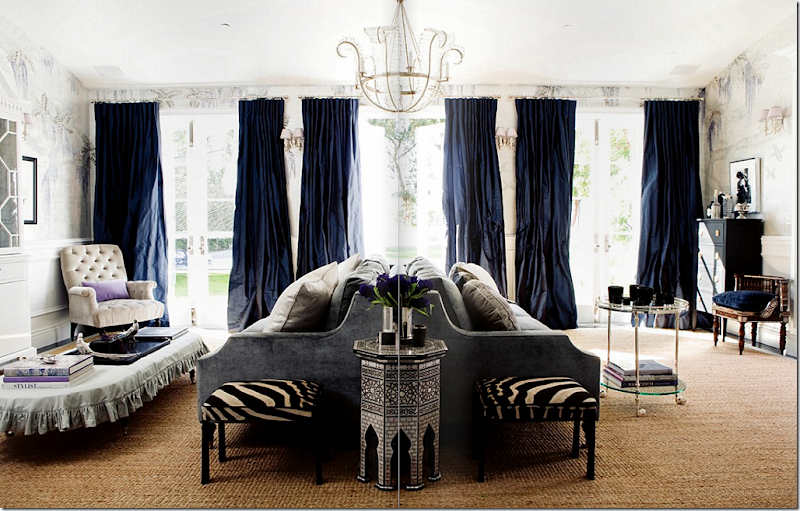
Many people don’t like curtains – they think they are dust collectors or they block the view out the window. Curtains don’t have to block views – they can actually cover the walls – not the glass. I’m one that loves curtains in most situations and doesn’t think a room is finished without them. They really make a huge difference – something that clients don’t anticipate until they are installed. Imagine this room by Windsor Smith without these gorgeous midnight blue taffeta curtains.
Light Fixtures
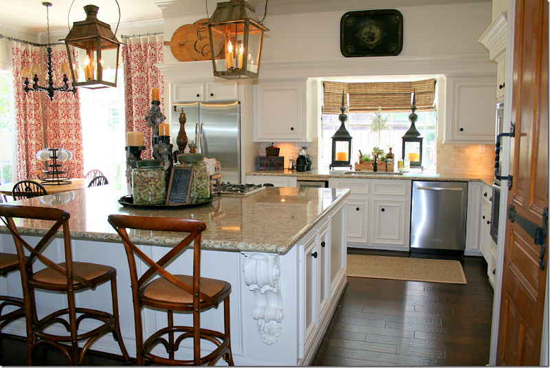
Rooms with hanging light fixtures and sconces are like rooms with jewelry. They just add a wonderful aesthetic to a room. This kitchen (from the 20 day renovation house) wouldn’t be quite as beautiful without these two wonderful lanterns, copies of French antiques.
Wall Décor
You don’t have to hang only paintings on the walls. I love to use plates and mirrors in lieu of canvases.
Antiques
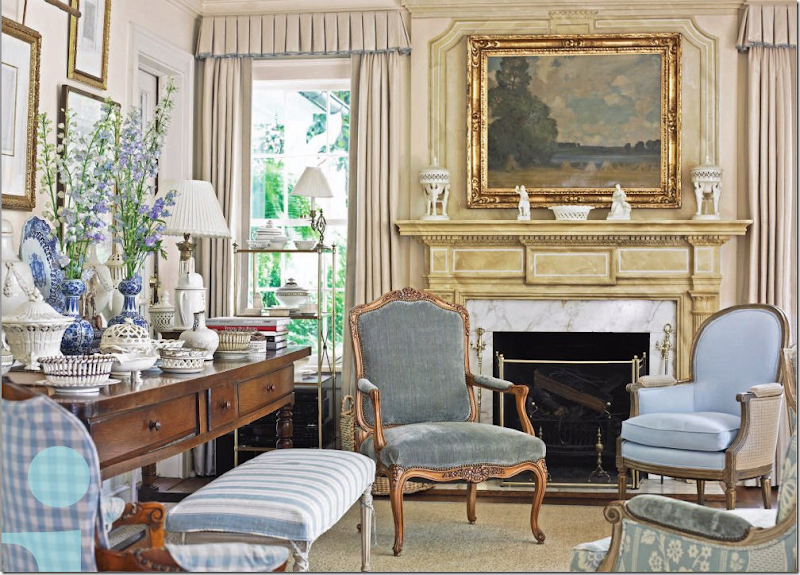
Antiques – furniture and accessories - warm up a room and keep it from looking sterile. They give a room a feeling of “patina” – where surfaces are worn instead of shiny and pristine. Here, Dan Carithers’ living room shows his beautiful collection of antique French furniture AND creamware. He has the most gorgeous collection of creamware I’ve ever seen. Just the two matching pieces, placed symmetrically on the mantel, are gorgeous enough!
Symmetry
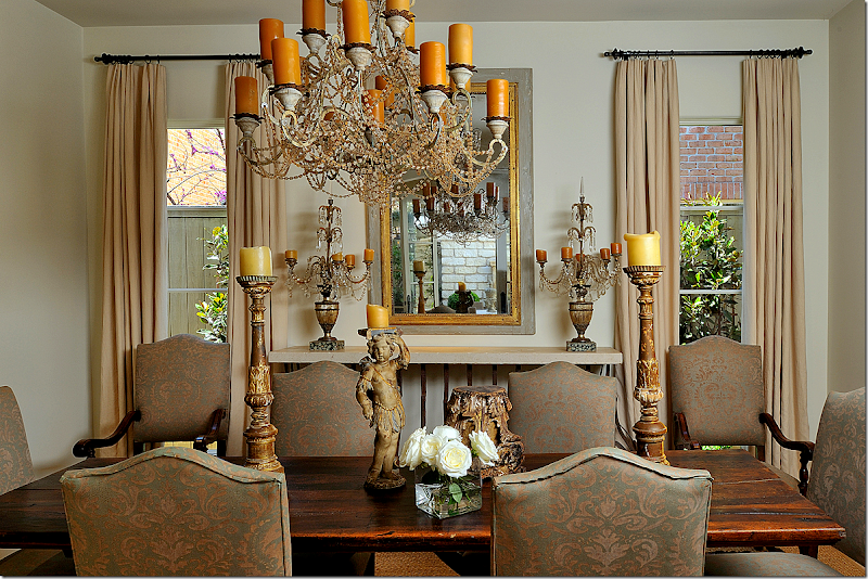
Top Ten Design Elements #8 was Symmetry. I like things balanced in design. I like pairs and right angles. It might be a symptom of OCD, but if rooms and furniture arrangements aren’t symmetric it makes me feel unbalanced. Here in this beautiful dining room by Ginger Barber there is perfect symmetry – the windows flank the console with its two symmetrical candlesticks. The table sits in front with six chairs around. Two extra chairs are balanced in front of the window.
Which brings us up to date: CdT Top Ten Design Elements #9 – Trendy
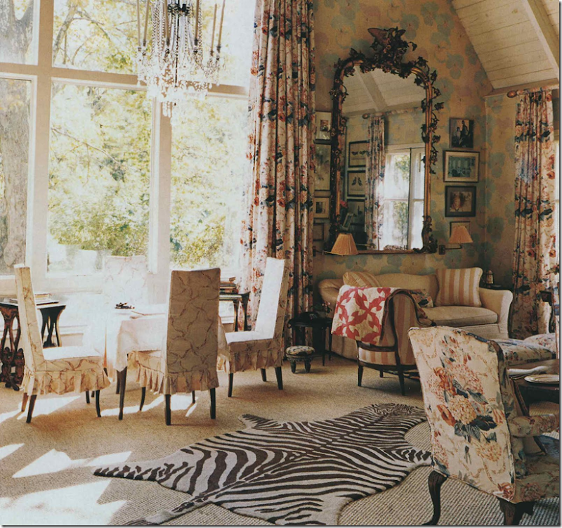
What???? Trendy? Seriously? Yes! What I mean is that I like when interiors are updated with a few trendy items, otherwise the room can be stale or look like a time machine. If there are few trendy elements around, it looks like the owner is invested in his space – he still shops for his house, looks at magazines, and tries to keep his house looking fresh and with-it. Trendy might be something like a zebra rug or a garden urn. It might be a set of faux white covered books or white coral. Trendy can be garden seats in neon bright colors or black and white subway signs.
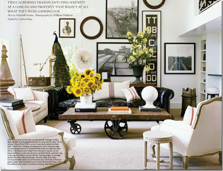
You don’t have to overdo trendy. This room has just about every current trend: subway sign, railway cart coffee table, grain sack fabrics, black and white photographs, and even a peacock. One or two trendy items are probably enough to make a room seem up to date without looking like a décor store. I will say, I probably have more trends in my family room than this room does.
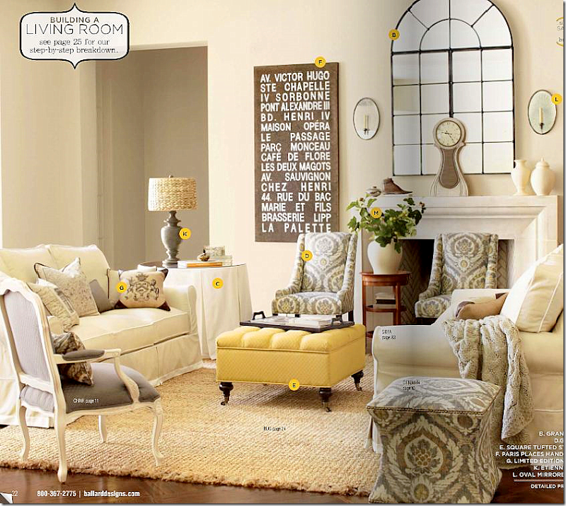
What you want to avoid is having your house look like a catalogue or shop – this is a room in Ballard Designs – showing typical trendy things – a mini Mora clock, urn lamps, tufted ottoman, subway signs, ikat fabrics, stools, and white vases. Still even though it is from a catalogue, it doesn’t seem overly trendy – only up to date.
ENTRY HALL:
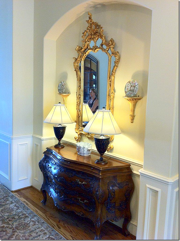
Starting with the entry hall. This is a before photo – before it was updated with a few trendy items.
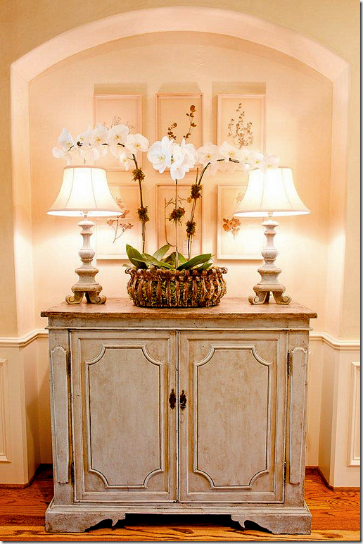
AFTER: By Munger Interiors – this entry hall now has a trendy gray painted console, with two trendy candlestick lamps. Added to the wall is a set of framed botanicals – another trendy way to hang art: hang a set of identically framed prints which together become one big piece of art.
While there was nothing wrong with the entry hall before, now it just looks more up to date, using light, gray woods, trendy lamps and art work.
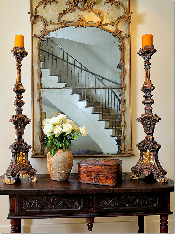
Trendy doesn’t mean new. In fact, this entry by Ginger Barber uses all antiques – yet the types of antiques are trendy. Altar sticks, confit pots, French painted and gilt mirror, Spanish styled console. Compare this entry with the “before” above – both use antiques, but the “before” antiques appear Granny compared to this assortment.
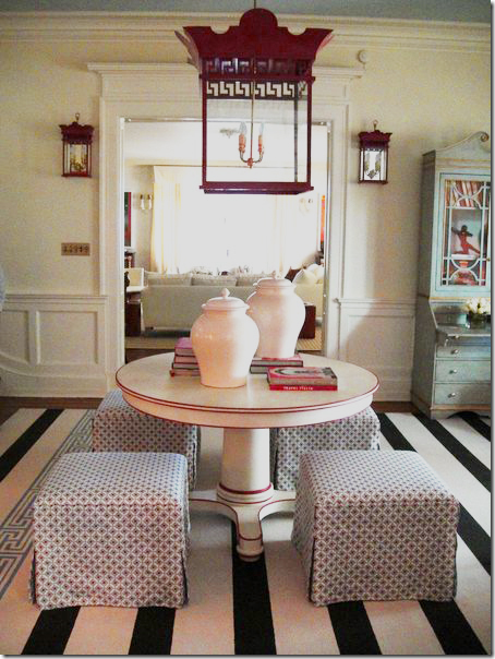
This entry designed by Tobi Fairley uses traditional elements in a trendy way – these lantern and sconces are so much more “in” than a brass and glass lantern. The round center table is painted instead of dark wood, as is the English secretary And the bold dhurri is more modern looking than a red and blue Oriental rug traditionally seen for centuries!
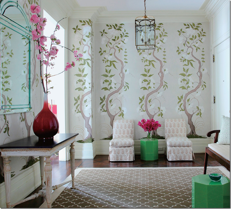
This entry uses a wallpaper based on an antique Swedish design, but even though it’s a copy from the 18th century, this design has lately become very popular. A more trendy lantern, along with pops of lime green tables resembling garden stools, mix with the antique, newly painted console table.
LIVING ROOMS:
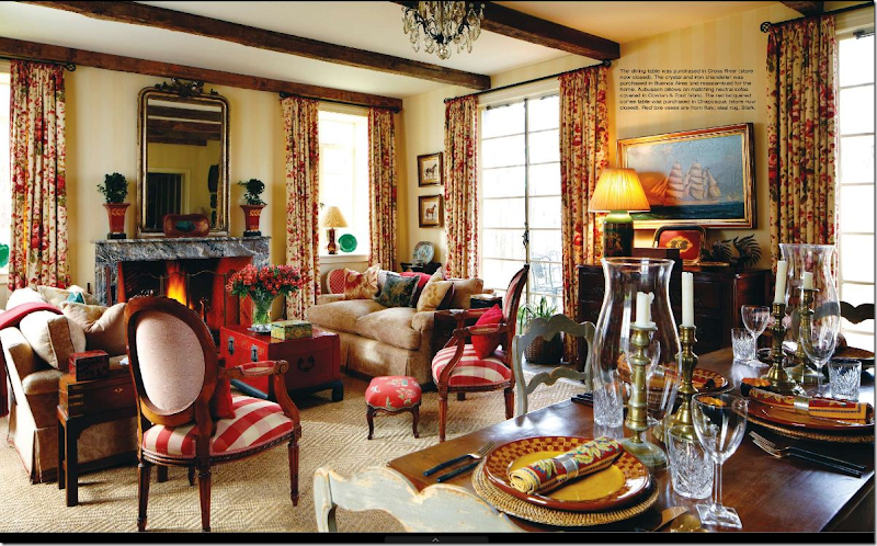
This living room/dining room is quite beautiful and was recently decorated, yet there really isn’t anything trendy or up to date in this room. The mantel accessories could be changed for a more up to date look and I would probably use just two plain pillows on the sofa. The rug is the only updated item here.
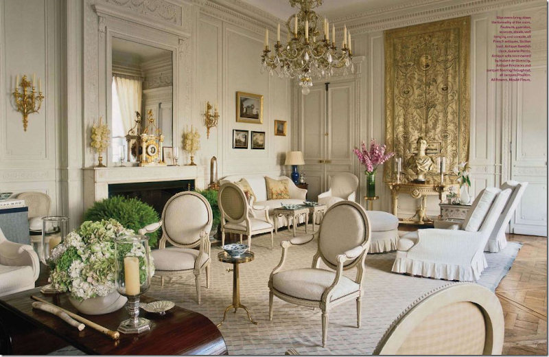
In comparison – this living doesn’t have many trendy items in it either. Yet, the grayish cream color scheme is more updated looking than the previous yellow and red one. Also, the slipcovers lend a youthful look.
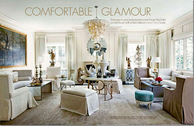
In contrast, this room is loaded with trendy items – the chandelier, the urns, the shells, altarsticks, modern wing chairs, the consoles, the sunburst mirror – which make the room look youthful and alive. No doubt the owner likes to tweak her house and shop for it – it probably has already changed a bit by now.
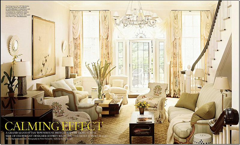
Jeffrey Bilhuber designed this traditional living room with less obvious trendy items. Hidden around are garden stools in white – not quite so noticeable. Two small sunburst mirrors flank an Oriental screen. Slipcovers on the unusually shaped wing chairs are playful looking. The chandelier is a modern interpretation and the lamps and coffee table are more contemporary. Again, the owners are probably younger and are invested in their home.
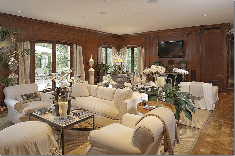
This house in Houston is full of trendy items – but it still looks classic. Large garden urns on pedestals flank the French door. All the furniture is slipcovered in white cotton giving the room an up to date look. Two seagrass rugs anchor the seating areas. The architecture of the room could have caused it to look very staid, formal, and lifeless. Instead the room is fabulous!
This room, similar to the one above, has two seagrass rugs that anchor the seating groups. Trendy gray painted furniture mixes with a chinoiserie-like coffee table. The religious art and santos on the mantel is a trendy choice, as are the lanterns. Nailheads have made a huge comeback – and seem fresh and youthful. Trendy can also be found in architectural choices such as the 0fireplace mantel – the large stone piece is modeled after an antique, yet this style is probably the most popular choice today – found in many new houses.
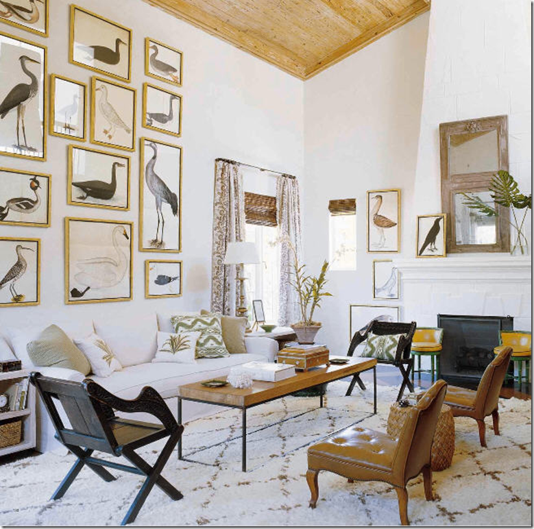
At first glance, you might not realize the trendy items in this living room – but they’re here! The collection of bird prints are a trendy choice – oft copied, even Anthropologie sold copies of this famous collection. And the rug, from Morocco became quite popular are few years ago and is considered trendy. Mix in the Ikat fabrics and the trumeau mirror and the room – thought not contemporary – is up to date and full of life.
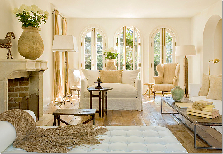
Pam Pierce updated her living room using a few trendy items. The Barcelona chaise, a modern classic, by Mies van der Rohe, is making a huge comeback these days. Another trendy choice is the brick layer styled coffee table – piled high with cream colored antique books. Note the mantel, as talked about earlier. The floors too are a popular choice in upscale houses – wide planks, stripped or limed, and rustic looking.
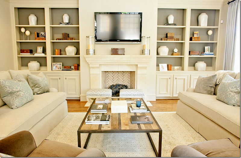
Another room by Munger Interiors has a trendy brick layer coffee table and the sofas have the updated one seat cushion – which I like to do when renewing clients older sofas. It looks more up to date than a sofa with three bottom cushions. Trendy gray paint in the bookcases highlight the accessories – a set of white vases in different sizes – another trendy choice. And the fireplace, again, the stone mantel.
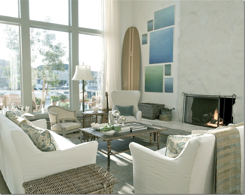
Velvet and Linen’s Steve and Brooke Giannetti’s beach house – is full of trendy choices that make this room up to date looking. A Swedish antique is a trendy choice in seating. I know it’s strange to call an antique trendy – but check the prices of these chairs today – compared to five and ten years ago to judge how trendy the barrel chairs actually are. Steve and Brooke designed the slipcovered furniture with its trendy Belgian lines. Baskets – in gray, are another updated choice, as is the lone velvet pillow in the chair. Gauzy linen curtains take the place of fancy pelmets and cornices. And, finally there are shells and coral. Taking it all in – this absolutely perfect room is cozy, warm and welcoming. It is casual - yet elegant. It’s obvious they are young and have wonderful taste – yet without the trendy choices, the room would not be so appealing.
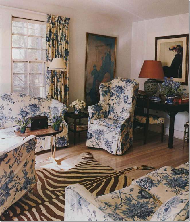
This and the next picture came from Mrs. Blandings blog – and I’m not sure what the vintage is – is it new or old? It is timeless. Yet – the seagrass and the zebra – two trendy choices make one think the room was recently designed. But was it? I honestly can’t tell if this was designed in the 50s or 2010s.
Again, what era is this? The furniture is definitely vintage – you can tell by the arms, but are the slipcovers new? Again- the trendy zebra could be from today or from the 40s? The only clue may be the lampshade on the blue and white lamp. Mrs. Blandings????
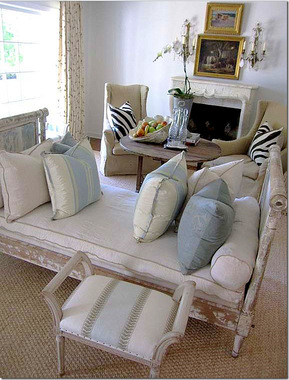
This living room has the trendy gray painted antique furniture and grayish white walls, along with large shells and contemporary wing chairs. Instead of the zebra rug – she chose a few zebra print pillows.
Faux skins are the rage right now, but I don’t personally care for fake zebra like this myself. Notice how the pillows and arm covers date the room, despite the rug. Plain velvet or linen pillows without the trim would be a better look and the upholstery would be so much more updated if the chairs had waterfall skirts. The wall color seems a little dated – as does the coffee table. Imagine if the table was round and higher, perhaps in a gray painted finish with gray walls and white or cream slips – the room would be so much more youthful looking. The room has a lot going for it though – it looks like they used Bennison for the curtains – which is the prettiest linen fabric you can buy.
(If you are the owners, don’t kill me! I’m just trying to point out ways to update the look!!)
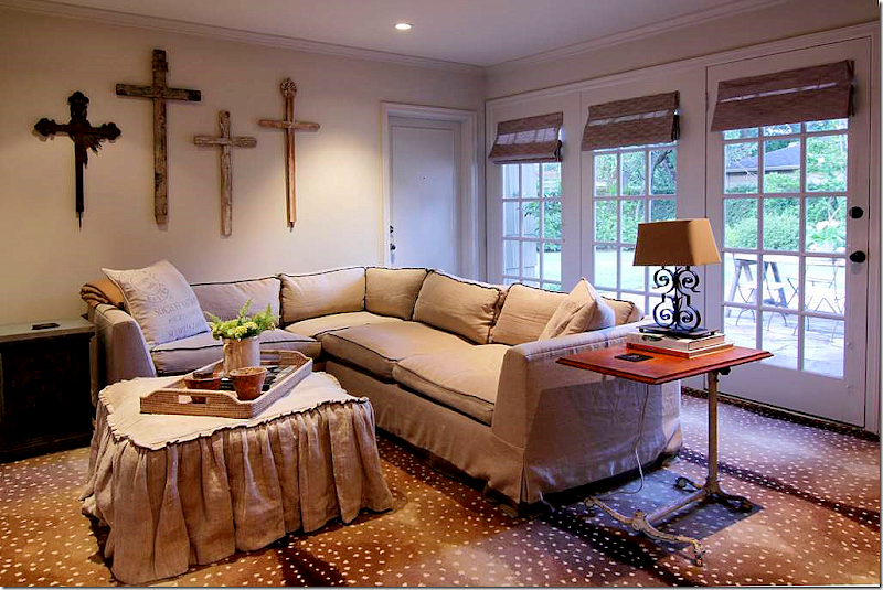
Patterned faux skin rugs are trendy – especially Stark’s antelope print seen here. Using this particular print updates a room immediately and looks so “hip.”
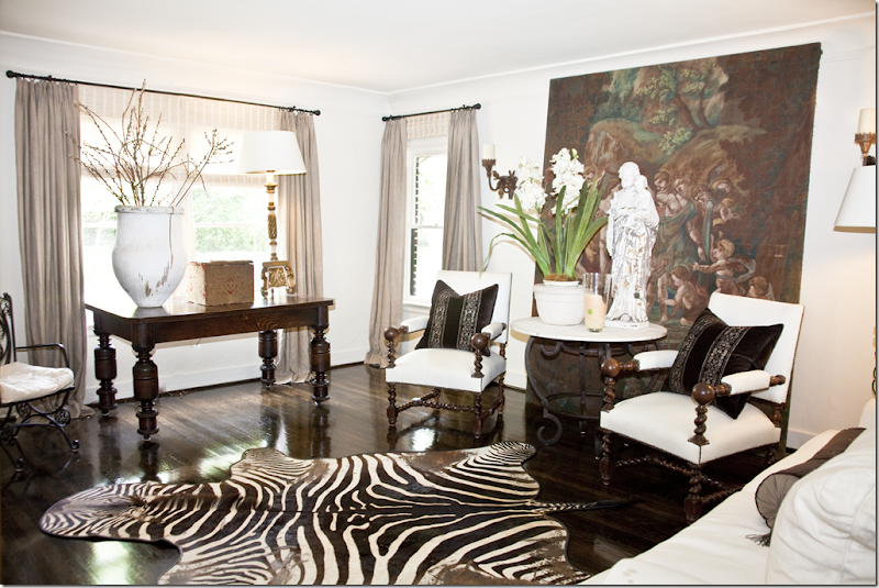
Mary Jane Gallagher used two zebra skins in her house, here and in the family room. Her living room has several trendy antiques – including the concrete statue and antique trim and tapestry pillows, usually paired with brown velvet as seen here. Her furniture is covered in white fabric – another up to date look, as are the plain linen curtains.
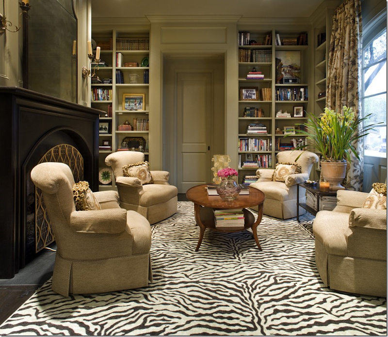
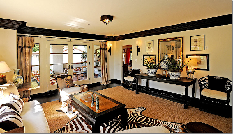
Taking a look at a few more zebras, it amazes me how zebra is so “in” right now. It looks especially great layered over seagrass. Mary McDonald.
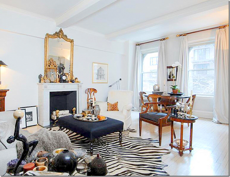
I love the undecorated look of this apartment in NYC. The painted white wood floor with the zebra over it is so chic. Another trendy item is the ottoman in lieu of a coffee table.
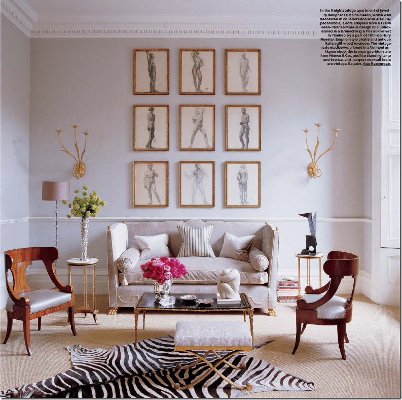
This oft seen image of another chic NYC apartment has the zebra layered over wall to wall seagrass – such a great look. The set of gilt framed nudes becomes one piece of art work. I prefer this type of art as opposed to a gallery wall of mismatched art and different frames – this is more symmetrical, which is a personal preference of course!
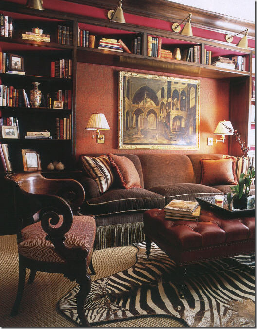
Another layered zebra over seagrass and another tufted ottoman instead of a coffee table. One more trend here – the library lights over the shelves. I see this look more and more and its so great looking.
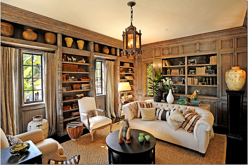
Moroccan inspired lanterns are hot today and very popular. More trends here is the tufted sofa – nailheads and tufting have made a big comeback in upholstery. And, the paneling is lightly stained in a grayish-taupe shade. Dark paneling seems so dated today. Mary McDonald.
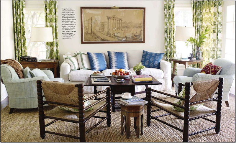
Apple matting, popular in England for decades, is being seen more and more in the states. Another Moroccan inspired look is the small table seen here. Tailored slipcovers are more trendy than loose ones – and in the chair, a textile pillow can be seen peeking out – another in look.
When Kathryn Ireland updated her living room – she added new fabrics. But the suzani prints on the two chairs really made the most difference in the update.
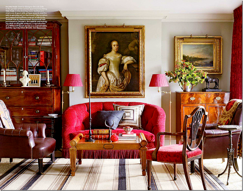
This classic English apartment gains a youthful look with the seagrass and striped dhurri rug. A Suzani throw over the chair looks more trendy than a simple wool one. Imagine this room with a typical red and blue Oriental rug – it would look so granny, instead it looks “today.”
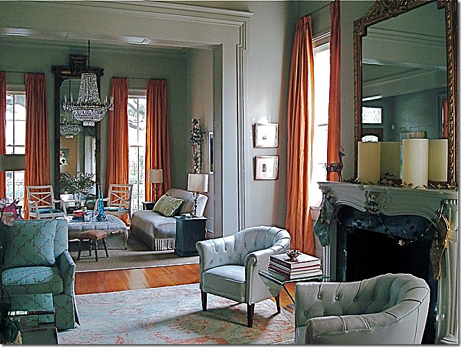
Finally, I love the New Orleans living room The Visual Vamp redecorated. Originally it was all green and French, now it is aqua and persimmon taken from the Oushak rug and she used many trendy items here. The owner loves mid century and Vamp loves bold. Read about the remodeling HERE.
THE DINING ROOM:
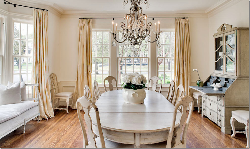
This dining room is all cream and white with Swedish antiques. Such a popular look. While bright colors and mix matched interiors are also in – in the South this particular look is is preferred by many.
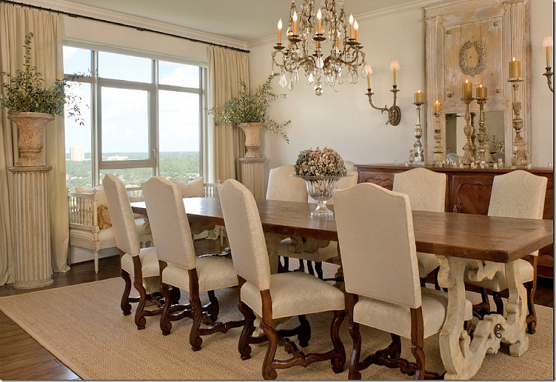
This dining room has a trendy Italian chandelier – a popular look in chandeliers. These were rarely seen before five years ago – and now even all the catalogues have copied them. Other trend items – the horns on the table.
This dining room by Michelle Nussbaumer has the same Italian chandelier, trendy urns and shells – all mixed with more traditional antiques.
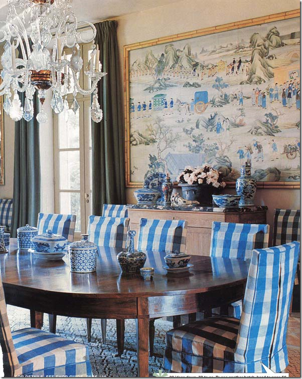
This dining room would be quite typical and dull if not for the trendy slipcovers in linen check.
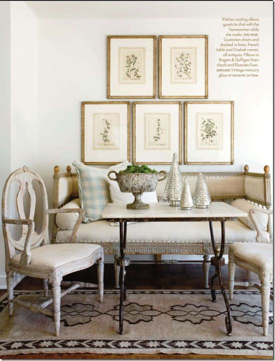
Swedish antiques and checks – with a set of botanicals.
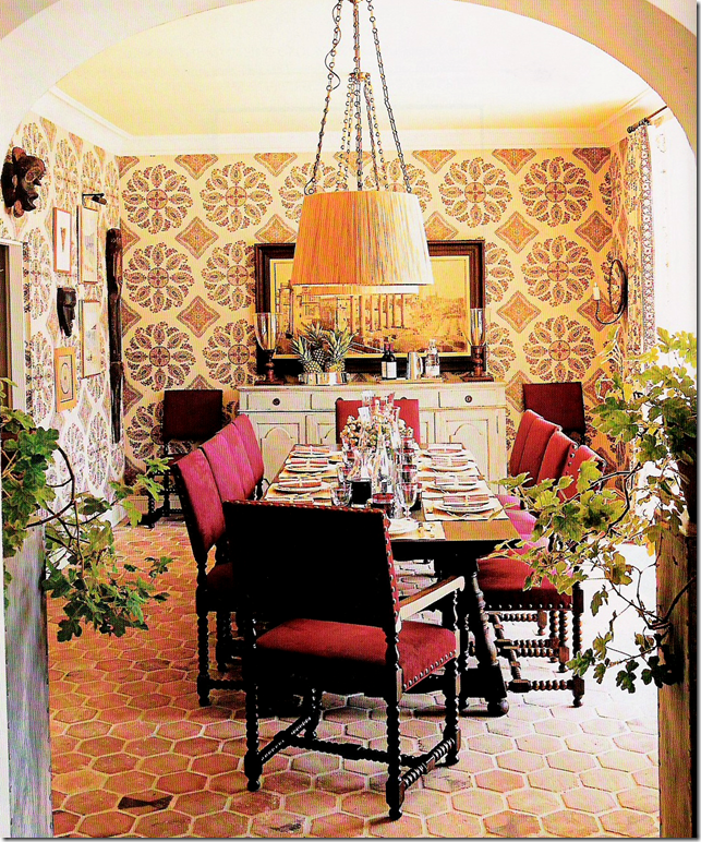
Trendy shades instead of chandeliers became the rage a few years back, while this Peter Dunham fabric on the walls is one of the more popular ones today. Painted console mixed with wood table helps the room from being too dark.
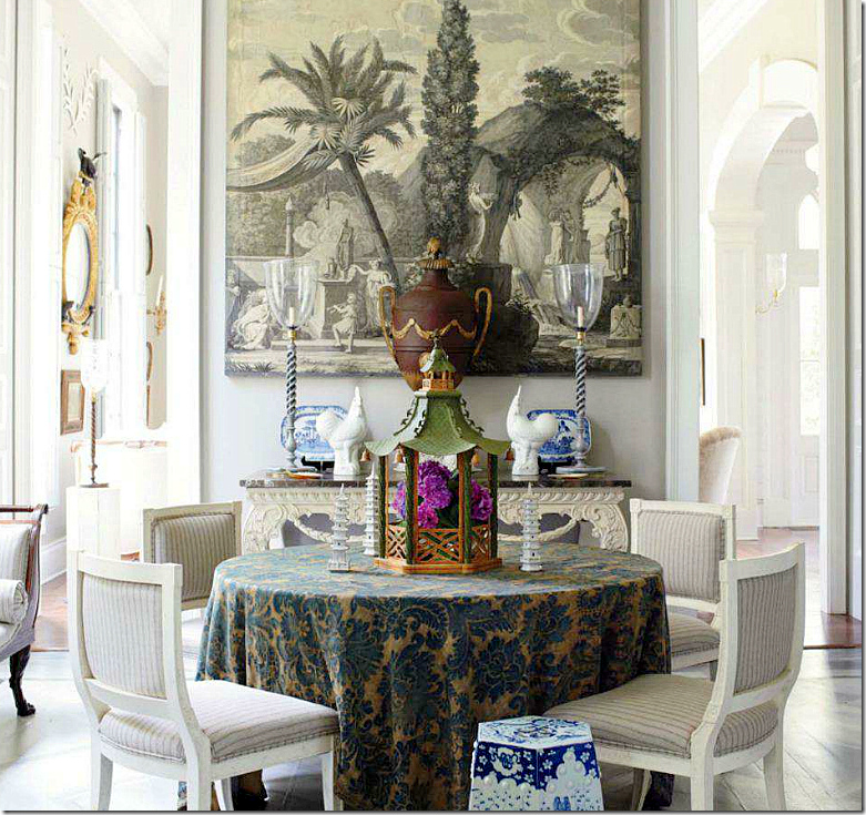
This dining room showcases gray – one of the hottest colors in home décor. Again, painted floor and furniture replaces dark wood. More trend items – the garden seat and grisaille mural.
Ginger Barber used a rustic trumeau and Swedish settee in this dining room. Urns flank the window while a collection of altarsticks sits on the console.
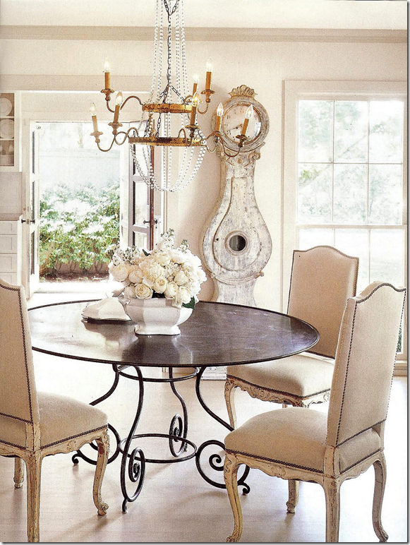
A Mora clock – another Swedish antique that is so trendy today. Painted chairs with nailheads.
Seagrass in the dining room where popular slipcovered benches take the place of chairs. More trends – the Italian wood chandelier.
In this guesthouse – lanterns, painted antiques, and an antique Mora clock make the room look fresh, and updated.
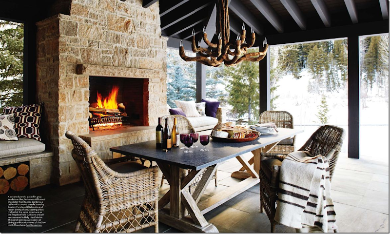
Gray or Kooboo wicker has replaced the regular stain seen for years. Here, the x-table with stone top is a trendy Belgian style made even more popular by Restoration Hardware.
KITCHEN:
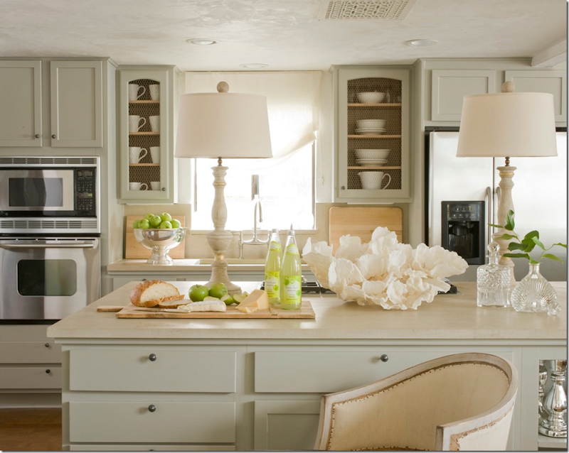
This kitchen by Steve and Brooke Giannetti was updated with gray painted cabinets – and doors replaced with chicken wire. Altarsticks turned into lamps are a most trendy style. An antique Swedish barrel chair and a large coral rose are two other popular decorative items.
This kitchen used several trends – a copy of the antique map of Paris is used as the backsplash, while two lanterns hang over the island. The bar stools are another trendy choice, as is the white marble.
BEDROOM:
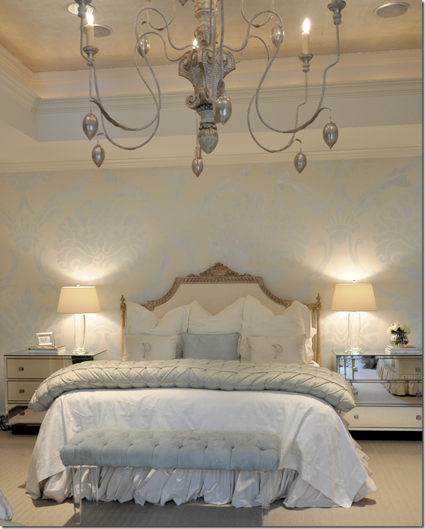
Mirrored furniture has seen a comeback in the past few years. Lucite pieces and glass lamps are two other trends. And – again, an Italian light fixture.
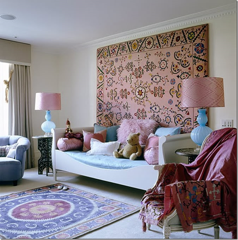
And, in this girl’s bedroom – trendy textiles – Suzanis – are used as art and rugs. Moroccan inspired side tables and colored glass lamps, along with white painted furniture are all trendy choices that help make a room look modern without being contemporary.
FINALLY:
This living room has made every design element – linen, slipcovers, seagrass, curtains, light fixtures, wall décor, antiques, and symmetry. I’ve wondered if it was going to make all 10 – I think it might! I just love the look of this room – I love the cluttered and cozy – yet light feel of the room. And yes, I do see trends here – the zebra rug layered over the seagrass, the light colored bound books on the mantel, the Ikat fabric and painted furniture.
Stay tuned for the final chapter of the Top Ten Design Elements – coming soon!
A quick announcement that next week I’ll be having a great giveaway – so be sure to enter. I have several wonderful ones planned in the future!!!
Home
»
»Unlabelled
» Cote de Texas Top Ten Design Elements #9
Subscribe to:
Post Comments (Atom)







0 comments:
Post a Comment