Recently, interior designer Cheryl Ketner from Plano, Texas submitted her kitchen for the Readers Kitchen Series. When I looked at her photographs, I was intrigued. Most kitchens that have been submitted have been white or some variation of white. This kitchen was red! Through the years I’ve been accused of showing only houses with gray paint and white slipcovers. I thought that this would be a perfect departure from that norm. I asked Cheryl to send more photographs of her house and was pleased to see that it was a total renovation – taken from plain builders grade to custom. I love total redos – I think they are a great help to those of you who are currently undergoing a renovation. Here are the before and after pictures of the “Red House.” Enjoy!
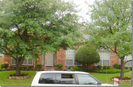
BEFORE: The house in Plano, Texas was a typical red brick home when the Ketners purchased it. Cheryl, an interior designer, sometimes works on projects with her husband Kerry, who is a contractor. Of course, this was one job they both were heavily involved in – their own house!
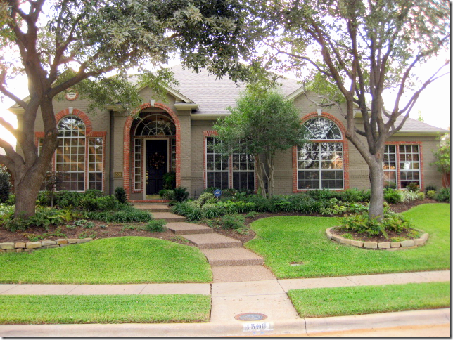
AFTER: in an unusual twist – the brick was painted a dark taupe color, but a row of red brick was left exposed around the windows – which highlight their arched shapes. This is such a great idea. Also, the trees were thinned out and the landscaped beds were greatly enlarged, creating much prettier curb appeal.
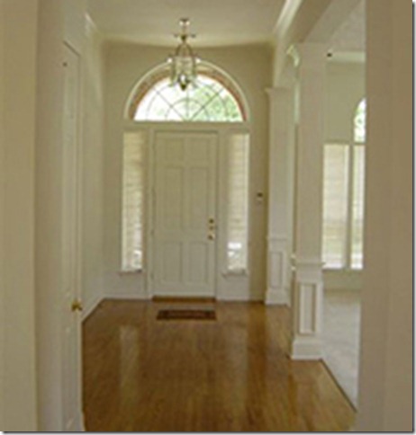
BEFORE The Entry Hall: The house had good bones, pretty moldings and high ceilings. But, Cheryl loves bright colors. Builders grade cream paint would never do for her.
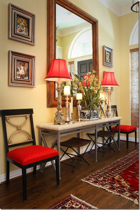
AFTER: Bright yellow paint fills the house. The moldings are painted white to highlight them. And red is introduced at the front door through the lampshades and chair fabric.
A variety of rugs cover the entry hall floor. Cheryl loves symmetry – as you can tell by this perfectly balanced vignette. I’m a symmetrical person too – you either are, or aren’t. Notice how the large mirror is the exact right size for this area.
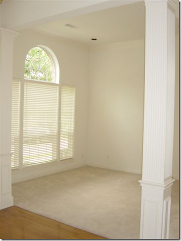
BEFORE: The living room and dining room are off to the left side when you enter. This room was carpeted.
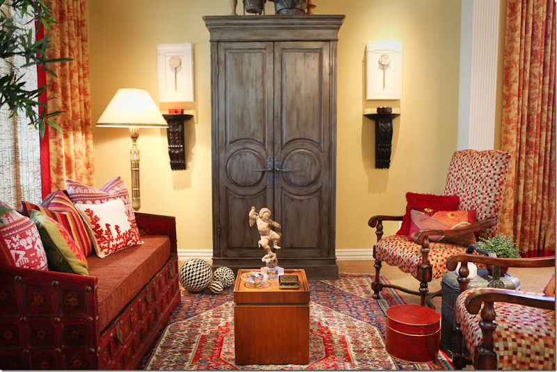
AFTER: The bright yellow room is now carpeted in wall to wall seagrass. Love that. An Oriental rug is layered over the seagrass. Red and yellow toile curtains hang in the living room and the dining room – to the right. A daybed takes the place of a regular sofa and the large armoire anchors the furniture arrangement.
The Ketners – Kerry and Cheryl. This is the only picture of the dining room – so you can see the homeowners too!!!! I wish we could see more of the room – the chandelier, and the table. Notice the elegant shades that are layered behind the curtains. Very pretty picture Cheryl!
BEFORE: The family room had a blah looking built in and was carpeted.
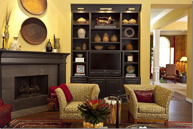
AFTER: The Ketners added hardwood floors in here and layered oriental rugs over them. Again, the walls are the same shade of yellow – makes for great continuity when all the public rooms are painted the same. Amazing – the bookcase looks brand new, but it was just painted black and lights were added to the top. Corner fireplaces can be tricky when arranging furniture – but Cheryl came up with the perfect solution.
Here you can see into the living room and dining room from this view. And you can see where Cheryl added lights to the bookcase – making them seem much more custom. Great idea. It also looks like crown molding may have been added to the bookcase too. The mantel was painted to match. Luckily, the tile surround was already dark and didn’t need to be changed.
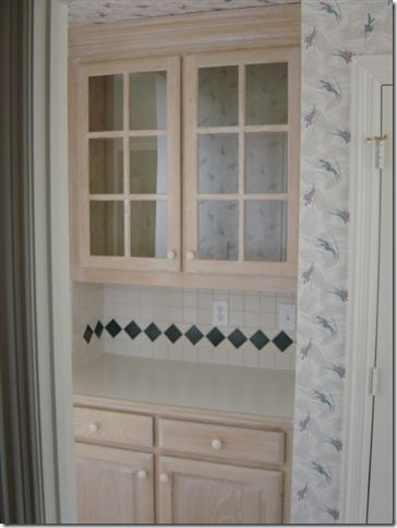
Before – The Butlers Pantry, between the dining room and kitchen, was stained the same as the bookcase.
TODAY: Fauxed black with red undertones, the paint completely customizes the pantry. Also new hardware updates it, along with seeded glass in the doors. All great ideas to emulate when updating cabinetry.
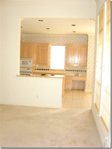
BEFORE: Looking from the family room into the kitchen, with more light stained cabinets.
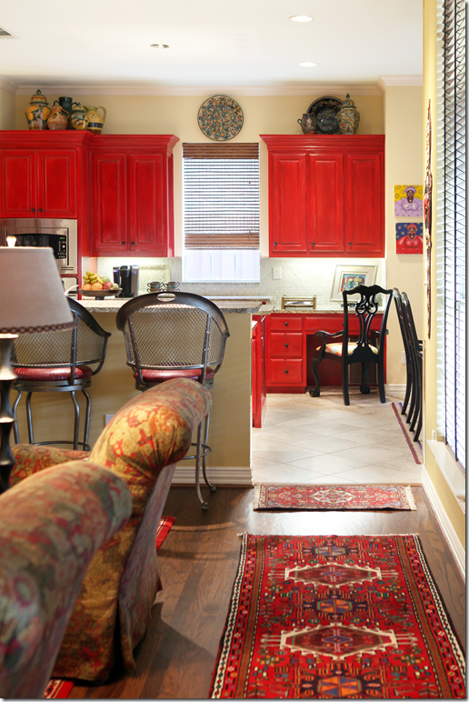
AFTER: The bar’s countertop was extended to make it more usable. And new tile was added – placed diagonally, which helps expand the room.
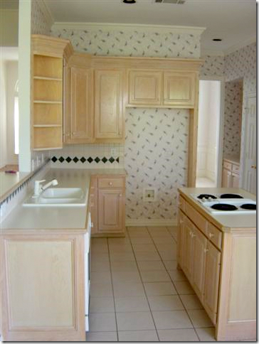
BEFORE: The footprint of the kitchen didn’t change at all. But, all the design elements did.
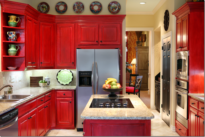
AFTER: New granite countertops and stainless appliances, along with a new tiled backsplash make the kitchen more custom. But, the biggest change is the red painted cabinets. They were fauxed to add more dimension to the paint job. New hardware was also added. The pantry door was painted black – a trick I like to do too. Who says a kitchen has to be white????
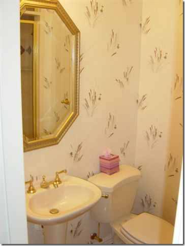
BEFORE: The powder room was nothing special.
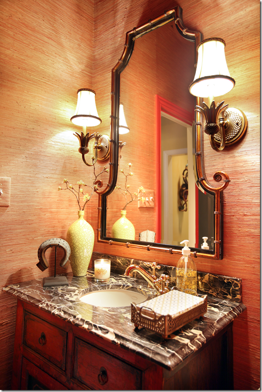
AFTER: It is now a little jewel box with richly veined marble and a red oriental cabinet. Grasscloth on the walls adds texture.
The Master Bedroom has the same paint – with a newly added textured carpet. Mismatched tables add interest. I really like the shades here – very pretty.
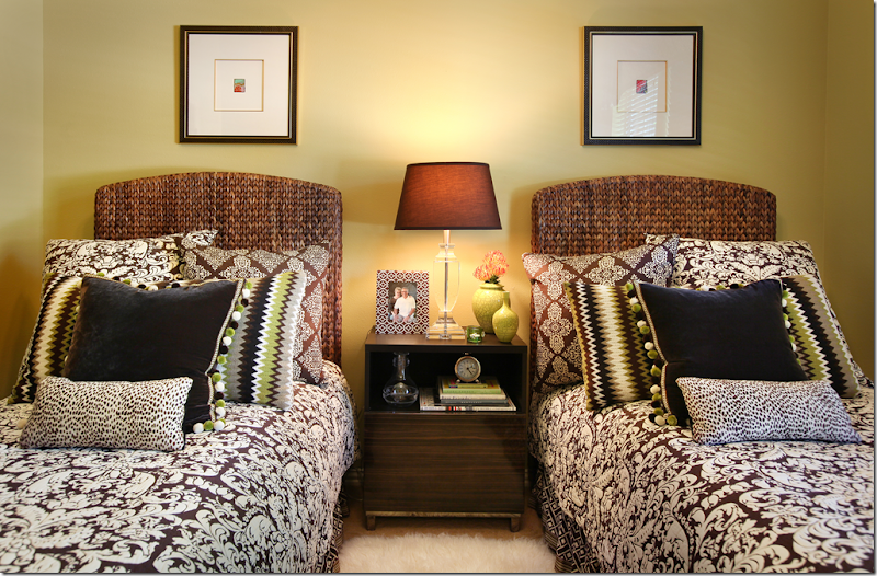
The guest room has brown and white bedding mixed in with greens and blacks. I love the touch of green.
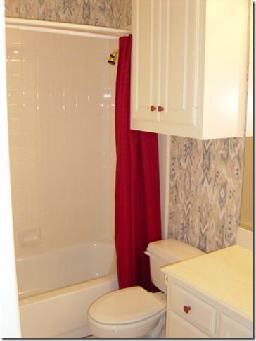
BEFORE: The guest bathroom.
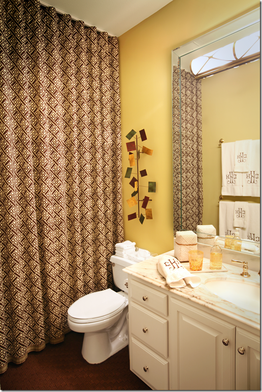
AFTER: Two great ideas to update a 90s bath without breaking the bank. Remove the cabinet hanging over the toilet! And raise the shower curtain to the ceiling. It looks so much more custom when raised. Add a mirrored frame around the mirror and new marble countertops to take it a step further.
The office is dark brown and very dramatic. The light colored desk pops against the dark walls. Red pops up in the accessories and the fabrics.
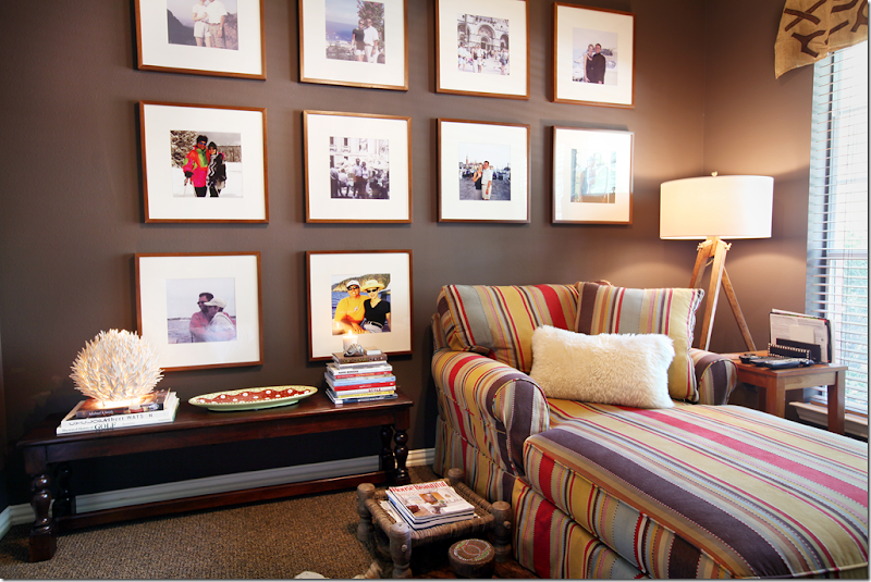
And here, in another room, the same dark walls are the perfect backdrop to the wall of art – another way to decorate without breaking the bank. Purchase identical frames and blow up your favorite family photos. The white mats really pop against the dark, brown walls. Again, red shows up in the fabric. Love that carpet.
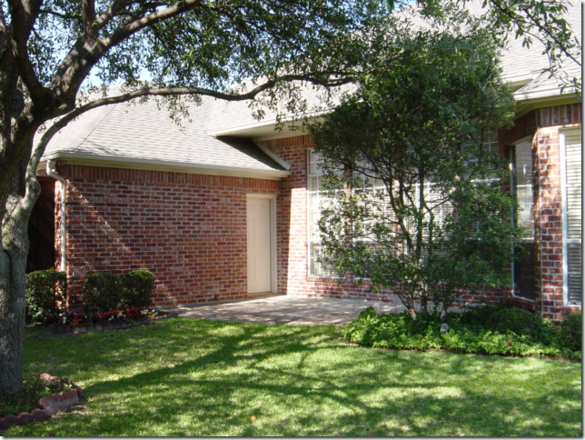
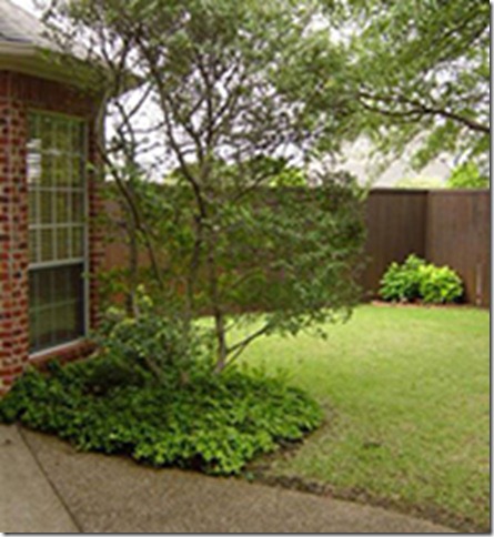
BEFORE: The back yard – with the red brick.
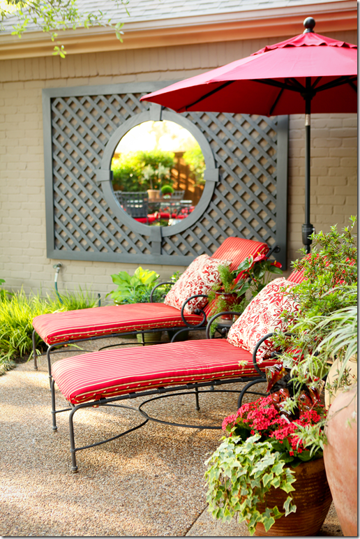
AFTER: With the brick painted a dark stone color – Cheryl added a mirrored trellis to the brick to create a focal point. All the outdoor furniture is covered in red and white fabrics – bringing the inside – outside. Another great way to add continuity to the design.
BEFORE: The back yard was all grass leading up to the fence.
AFTER: Now, instead of just grass, there is a large deck with benches that surround it. Again the red follows from the inside out.
I hope you have enjoyed looking at the Ketners colorful home! They took a rather bland house and turned it into a cozy, warm and inviting home – by painting it a bright yellow and using vibrant red throughout.
To read more about Cheryl, visit her web site HERE and to learn about Kerry’s contracting company, go HERE.
A million thanks to Cheryl and Kerry for inviting us to peek into their house!!!
Home
»
»Unlabelled
» AND NOW FOR SOMETHING COMPLETELY DIFFERENT: RED!
Subscribe to:
Post Comments (Atom)








0 comments:
Post a Comment